Memory Machine
Digital Memory Aid
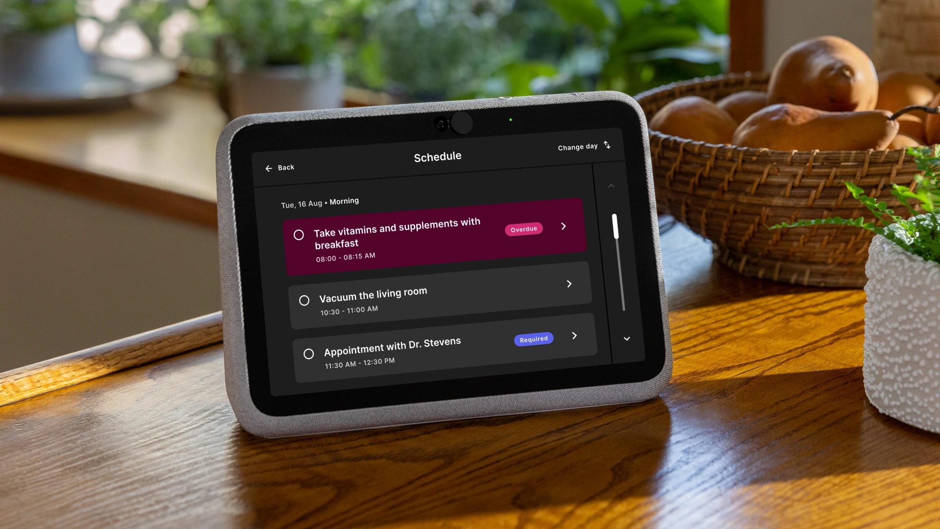
Memory Machine assists people living with Alzheimer’s disease by using personalised prompts and reminders to support memory and routine. User research highlighted design and accessibility challenges in the product’s design. I created a design system and UX guidelines to rectify these issues while enhancing usability and accessibility.

UX Consultant
Apr 2023
-
Sep 2023
- Founder
- User Research
- Design Guidelines
- Design Systems
- User Interface
- Interaction Design
UX Challenge
The challenge was to create a visually appealing, intuitive and accessible design system for users who may be suffering from cognitive, mobility or visual impairments. As the target audience can become easily stressed or confused, I needed to ensure that the design system would produce experiences that were intuitive and easy to navigate.
Discovery
Before designing the solution, I needed to understand the unique characteristics of those living with Alzheimer’s disease. I undertook a number of research practices including literature review, user interviews and observation, consulted with experts in the field, and reviewed accessibility guidelines (e.g. WCAG).
The literature helped me understand the many changes and impairments as the disease progresses that I would need to accomodate in the design, including:
Short-term memory impairments
Impaired problem solving
Motor impairments
Disorientation
We interviewed Alzheimer's patients and their caregivers to understand their needs, struggles, and behaviours with the product. Their feedback revealed the following issues:
Overwhelming content
Complicated navigation
Inconsistent interface
We consulted with numerous guidelines for designing for an older population. Comparing our product to the WCAG 2.1 helped us identify areas lacking compliance and ways to improve:
Avoid relying on colour
Ensure high colour contrast ratios
Ensure larger text sizes for better readability
Use larger touch targets
Limitations
Being a small start-up with limited resources, we leant on the amazing work done by others where possible. For example, the design teams at Adobe and IBM have done amazing work creating accessible colour palettes.
We decided to utilise the Adobe Spectrum colour palette to cut down on design time. Similarly, I found that both Apple CarPlay and Android Auto provided helpful guidelines to conceptualise designing work flows for low cognitive load.
Guidelines
Out of the discovery process, I created a set of guidelines and recommendations to help accomodate users of the platform.
1
Visual accessibility
To account for reduced visual acuity and contrast reduction, the design system adopted a type scale with a larger base size alongside high contrast colours. Colours need to meet a minimum contrast ratio of 4.5:1.
Design
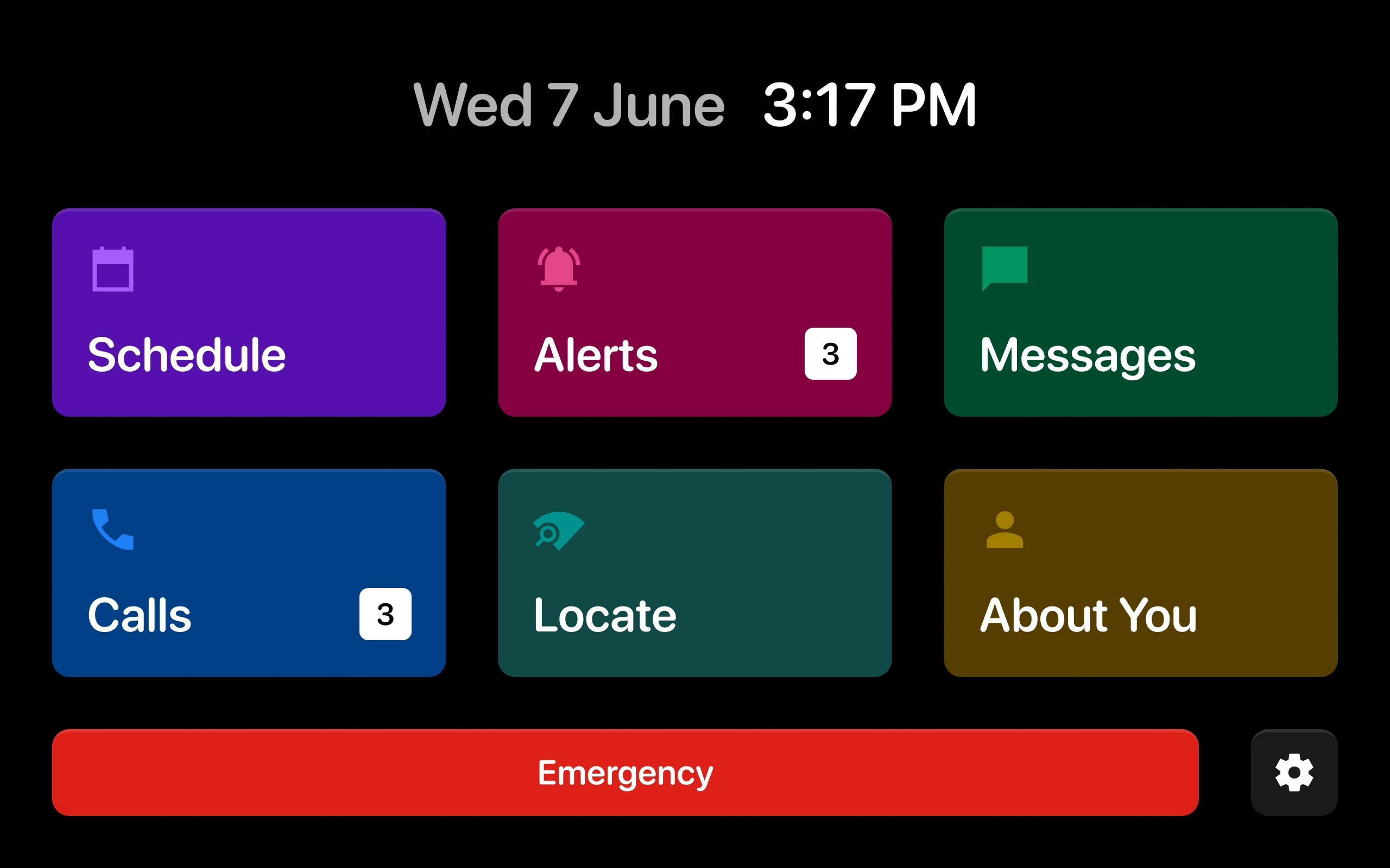
Below are some examples of the guidelines as applied to the interface.


Implementation & Results
The recommendations were implemented over a series of iterative design phases. Each change was tested with our users for feedback. Post-implementation, there was a significant reduction in instances of user confusion or stress. We received positive feedback from caregivers who noted an improvement in the ease-of-use and effectiveness of Memory Machine.
Conclusion
This case study underscores the importance of accessibility in UX design, especially for users with specific needs. Through a user-centred approach and standard accessibility guidelines, we improved Memory Machine’s functionality, making it a more reliable and effective tool for people with Alzheimer's and their caregivers.
Continued testing and user feedback will guide future enhancements, ensuring Memory Machine remains an accessible and user-friendly aid for Alzheimer's patients.