Acuris
Scripta Publishing System
I designed and delivered the first phase of a content publishing system for journalists. We selectively targeted impactful business and usability needs resulting in a redesigned information architecture, a responsive interface, and touch-friendly tagging. Results indicate that we halved publishing times while vastly increasing usability.

Senior Product Designer
Jul 2019
-
Jan 2020
- Product Owner
- Business Analyst
- Fullstack Developers
- User Research
- User Flows
- Wireframing
- User Interface
- Prototyping
- User Testing
User problem
Users subscribe to Acuris for fast and accurate financial intelligence - but customer feedback indicated growing dissatisfaction with the service.
The publication of intelligence relied on an outdated system (see video below) leading to publishing delays, loss of work, and critical lapses in metadata tagging. These factors posed a major risk to the business.
Basically this is the worst CMS I've ever encountered. I can't think of anything that is intuitive or easy to use.
Basically this is the worst CMS I've ever encountered. I can't think of anything that is intuitive or easy to use.
It requires 48 human decisions to publish -- I've been doing it for 17 years and it is the most archaic system ever, which increases the risk of errors exponentially.
It requires 48 human decisions to publish -- I've been doing it for 17 years and it is the most archaic system ever, which increases the risk of errors exponentially.
Roadmap
We went live with a minimum viable product meeting the needs of a pilot group of users.
I worked with the Product Owner to define product goals, and defined metrics which would assist us with understanding whether we met these goals.
1
Reduce the time spent creating, formatting and editing content
2
Enrich content and improve storytelling
3
Deliver a consistent subscriber experience
4
Ensure content adheres to Acuris publishing and compliance standards
1
Reduce publishing time by half
2
Increase usability score from 38 to 70+ (SUS)
Pilot group
In order to simplify our requirements for phase one, we elected to test with a pilot cohort - the court reporting team. Commonly reporting from inside the court room, these reporters had a unique requirement for on-the-go publishing. This team comprised of three of the four identified user types.
I work with my team to find, research and write the news stories that keep our customers up to date
Key tasks
- Research previous articles
- Background research
- Fact-checking
- Create new articles
- Add metadata, contributors + source notes
- Set article priority
- Edit/amend articles
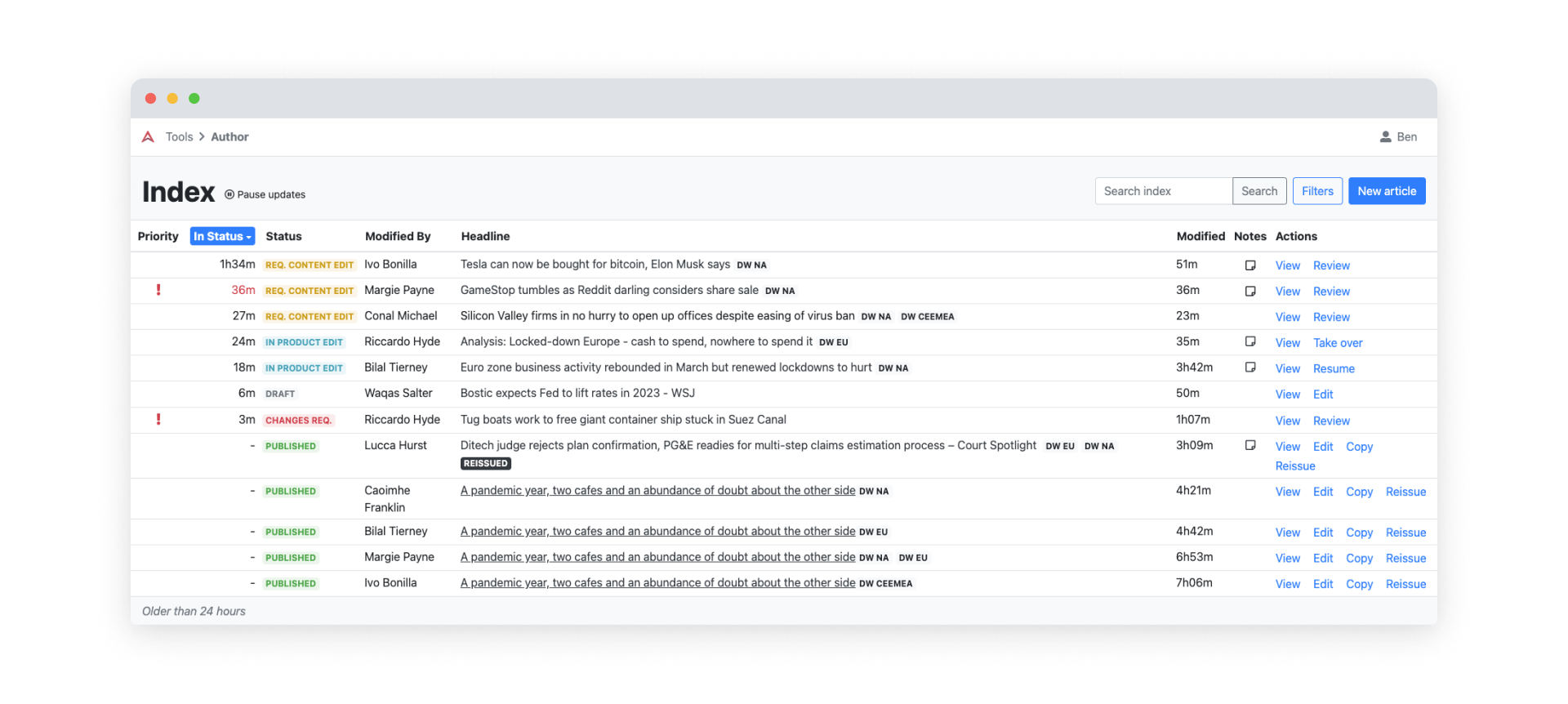
- Track status of articles
Context
- Heavy user of the article editor page
- May have multiple articles in the publishing pipeline simultaneously
Other products used
- Email: communicate with colleagues + sources
- Text editors: draft articles + work collaboratively
- Messaging: communicate with colleagues and sources, collaborate, share information
I manage my reporters and help them to create the best content for our customers
Tasks
- Review articles + journalist productivity
- Track status of articles
- Research previous articles
- Create articles
Context
- Heavy user of both the article index and article editor page
Other products used
- Email: communicate with colleagues and sources
- Text editors: draft articles and work collaboratively
- Messaging: communicate with colleagues and sources, collaborate, share information
I review our reporter’s stories and check that they are ready before I publish them
Tasks
- Prioritise + publish articles
- Review article copy and metadata
- Research previous articles
Context
- Heavy user of both the article index page
Other products used
- Email: communicate with colleagues
- Text editors: draft articles and work collaboratively
- Messaging: communicate with colleagues and sources, collaborate, share information
I provide teams with background knowledge on requested topics
Tasks
- Research previous articles
- Advanced search + filter of article index
Context
- Light user of the article editor page
- Heavy user of the article list page
- Conducts research on external websites as well as on legacy platform
Other products used
- Email: communicate with colleagues
- Text editors: draft articles
- Messaging: communicate with colleagues and sources, collaborate, share information
Limitations
The tight timeline necessitated design limitations.
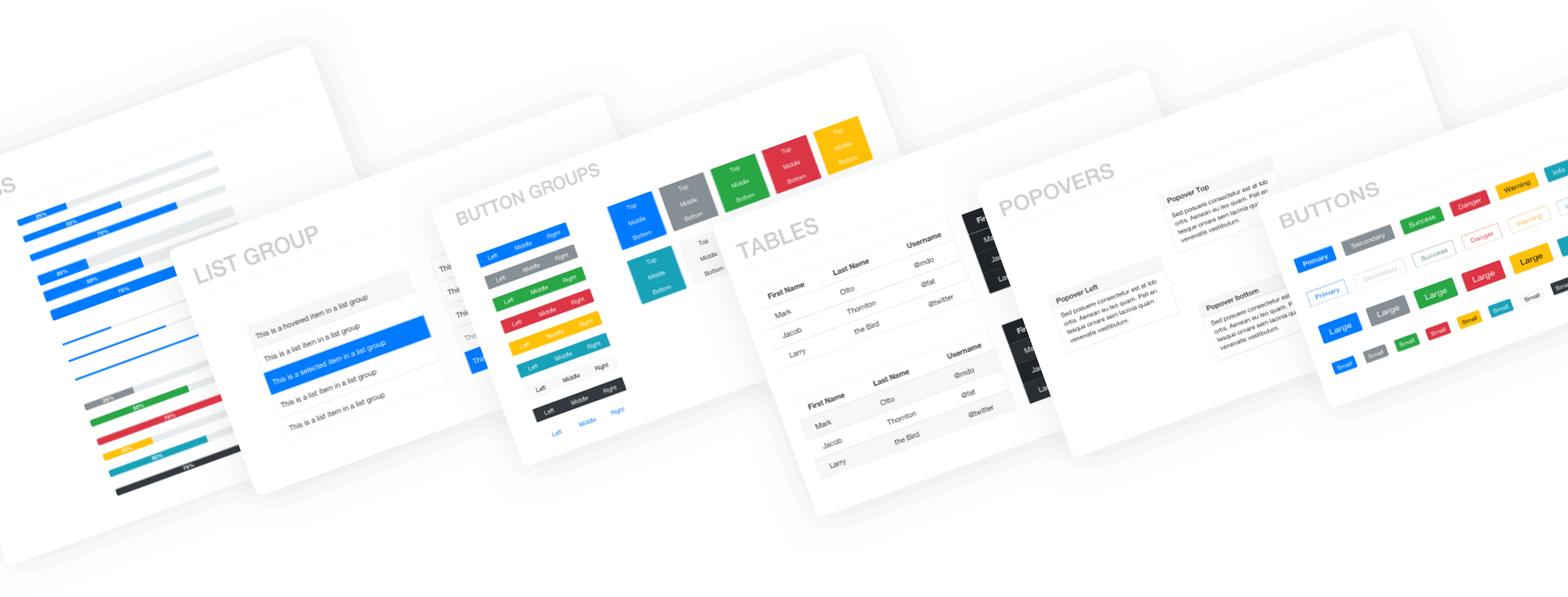
We utilise standard frameworks and off-the-shelf components (e.g. Bootstrap component library). We limited the front-end to default Bootstrap 4.6 (e.g. colours, grid, spacing, typography).
We additionally needed to adapt the existing publishing workflow to work on mobile devices to allow for on-the-go reporting.

The solution
I worked with the product owner to identify and prioritise three key areas for redevelopment.
1
Information hierarchy
The unintuitive grouping of fields in the legacy system was leading to important data being omitted. We undertook research to understand the mental model of our users, and used the findings to rationalise the information hierarchy.
2
On-the-go reporting
An important requirement for court reporters was the ability to publish stories on-the-go. Editors requested the ability to compare the structure of metadata against the body copy. This necessitated a rethink of the entire interface - resulting in a tabbed interface at mobile and a two-panel interface at desktop.
3
Touch-friendly tagging
The legacy system relied purely on using a keyboard and mouse for metadata tagging. As part of the redevelopment, we had to design these interactions to be both touch-friendly and responsive.
The redesign also introduced automatic tagging so when users matched companies to our database, the system automatically added relevant tags. As the process was not 100% error-proof, we additionally had to design the ability for users to correct these errors.
The videos below demonstrate how we allowed humans the option to alter automatic tagging in a touch-friendly manner.
Results
Publishing time was reduced by half.
We successfully reduced average publishing time from 35 minutes down to 14. The reduction in publishing times helped Acuris maintain a competitive advantage by ensuring that relevant content was being quickly delivered to paying subscribers.
We doubled our usability score.
The SUS score of product rose from 38 to 76. User feedback indicated that multiple usability issues were solved - work was no longer being lost, fields were laid out more logically, and most importantly, important tags were not being missed.
100%
increase in usability score
59%
decrease in publishing time
Feedback
User feedback was extremely positive regarding the changes - most notably surrounding the simplification and rationalisation of the data tagging.
It's a big improvement over the old back end as it's a lot simpler and more streamlined.
Extremely slick compared to the old publishing system. The lateral layout of the interface is far more user-friendly than the current system.
Reflections
Although frustrating at times, limiting the UI to vanilla Bootstrap caused me to focus on the fundamental UX patterns, forcing me to think creatively about how I could combine the set of off-the-shelf components to create something delightful.
I additionally learnt that improvements are iterative - although the interface may seem rough at the start - as long as you get the fundamentals correct you have a solid foundation on which to grow.