Australia Post
Parcel Locker Redesign
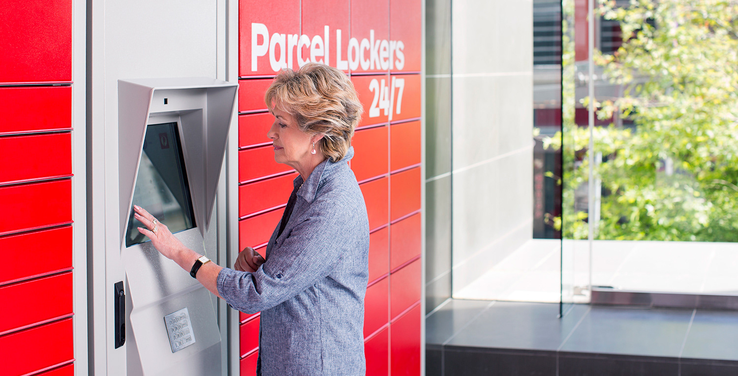
Parcel Lockers allow customers to easily collect parcels both in-and-outside of business hours. An ergonomics review of the existing locker interface identified accessibility issues. I redesigned the interface to reflect newer brand guidelines and fix outstanding UX and accessibility issues.
Role
Snr. Product DesignerTimeline
Jan 2016 - Jun 2016Team
- Digital Producer
- Content Producer
Responsibilities
- User Research
- User Interface
- Prototyping
- Illustration
- Design Systems
UX Challenge
Australia Post Parcel Lockers allow customers to easily collect parcels both in-and-outside of business hours. Their use is correlated with increased customer satisfaction and reduced delivery cost. The business was aggressively promoting their usage.
However, an ergonomics review of the existing locker interface had identified accessibility issues. Tackling these issues provided the perfect opportunity to redesign the locker interfaces - fixing both UX and accessibility issues while implementing more recent brand guidelines.
Approach
My team ran workshops to define scope and document limitations and considerations. We used flows to document user journeys and conducted research to answer gaps in our knowledge. We employed paper prototypes to ensure the flows felt natural in practice. Only once the flows were confirmed did we invest time into completing high-fidelity designs. At the end of this process, we delivered a UI kit and specification document to an off-shore development team.
Activities
Stakeholder workshopsCompetitor analysisObservational researchUser journeysPaper prototypingHigh-fidelity designConsiderations and limitations
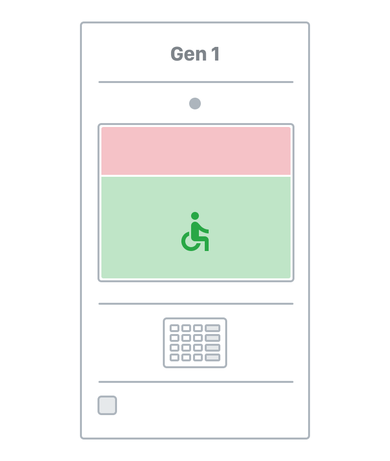
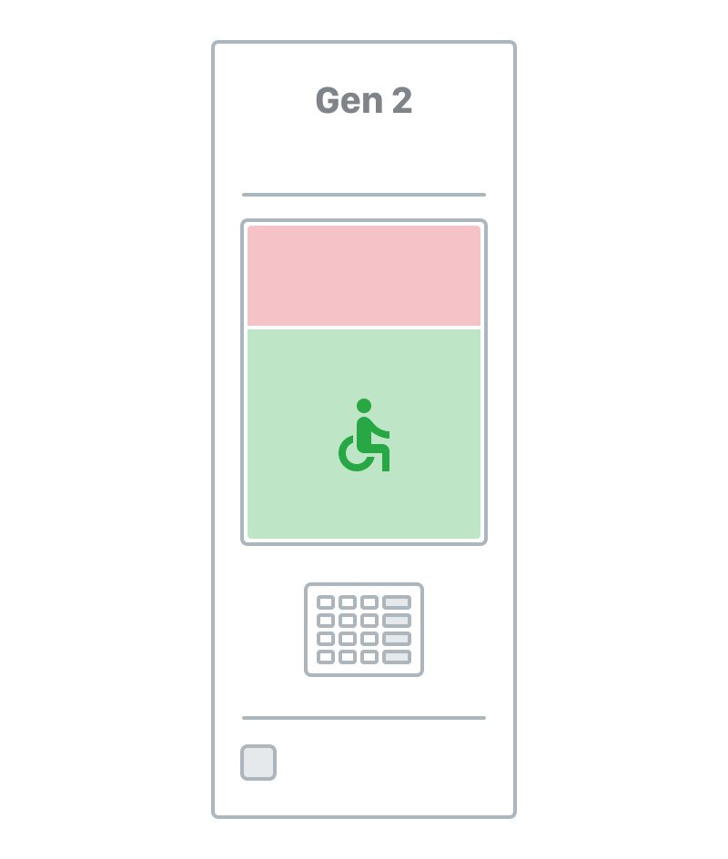
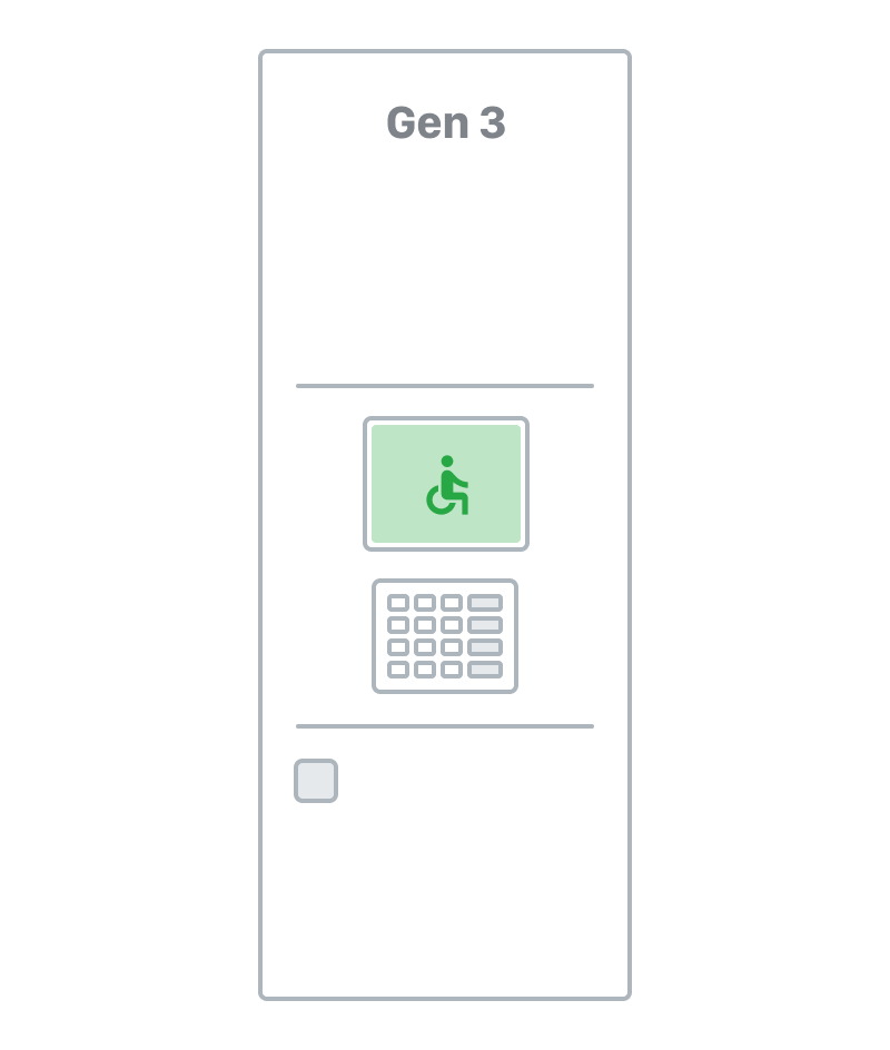
The ergonomic review found issues relating to screen visibility, touch detection, vision-impaired access and wheelchair accessibility. Three different generations of locker were in active use - each with a different screen size and orientation. Furthermore, the locker software did not support video, animation or analytics.
Utilising observational research
As the lockers lacked analytics, we were unable to determine customer preferences from usage. To work out the most preferred method for authenticating at lockers we undertook observational research by noting the method used by 30 customers when collecting their items.


Competitor analysis gave us an idea of 'best practice'
We wished to understand the range of experiences offered by kiosks currently in the market, deemed our 'experience competitors'. The best performing interfaces exemplified the ‘KISS’ (Keep It Simple Stupid) paradigm. I crafted a set of best practice guidelines after analysing the best performing kiosk interfaces.
Solutions
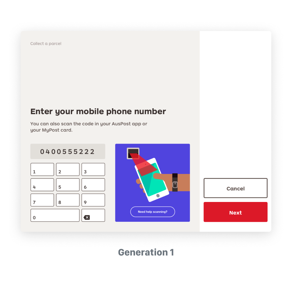
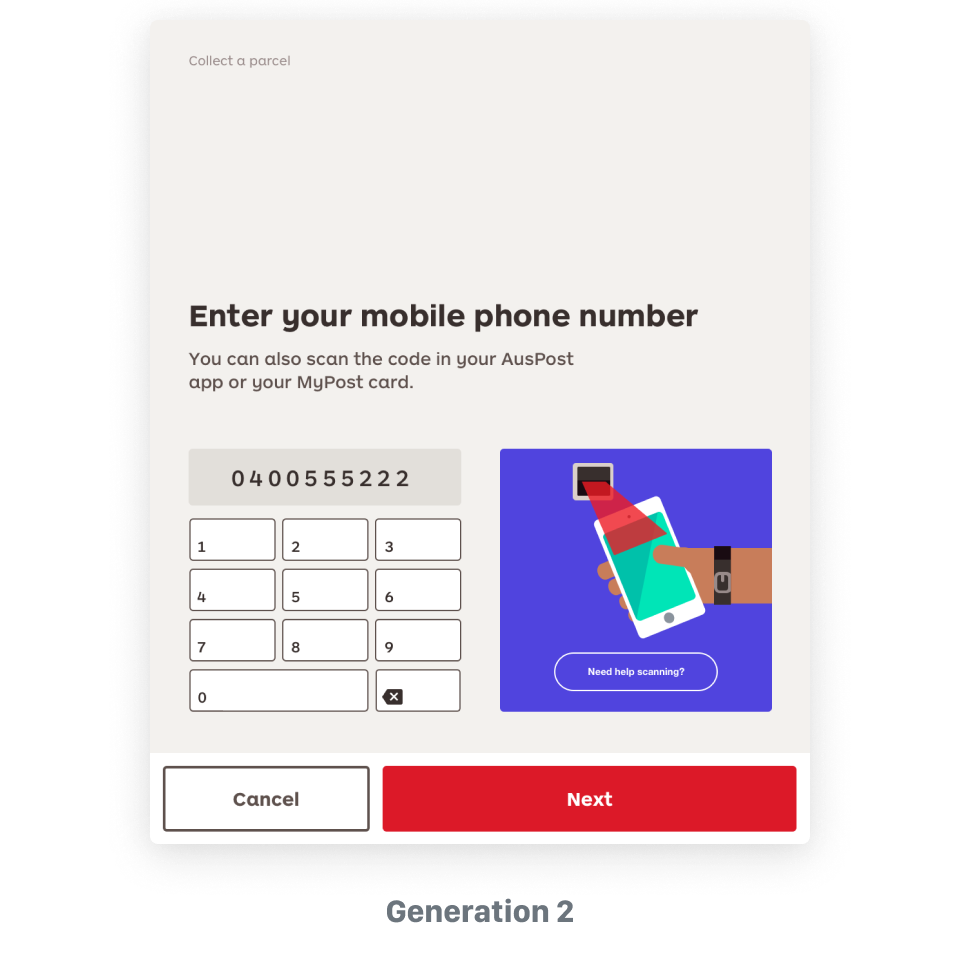
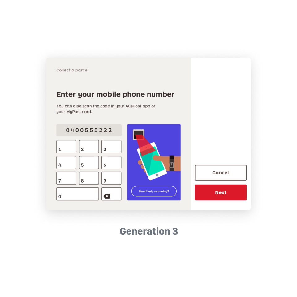
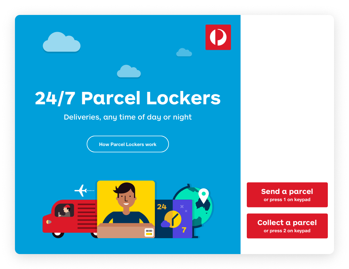
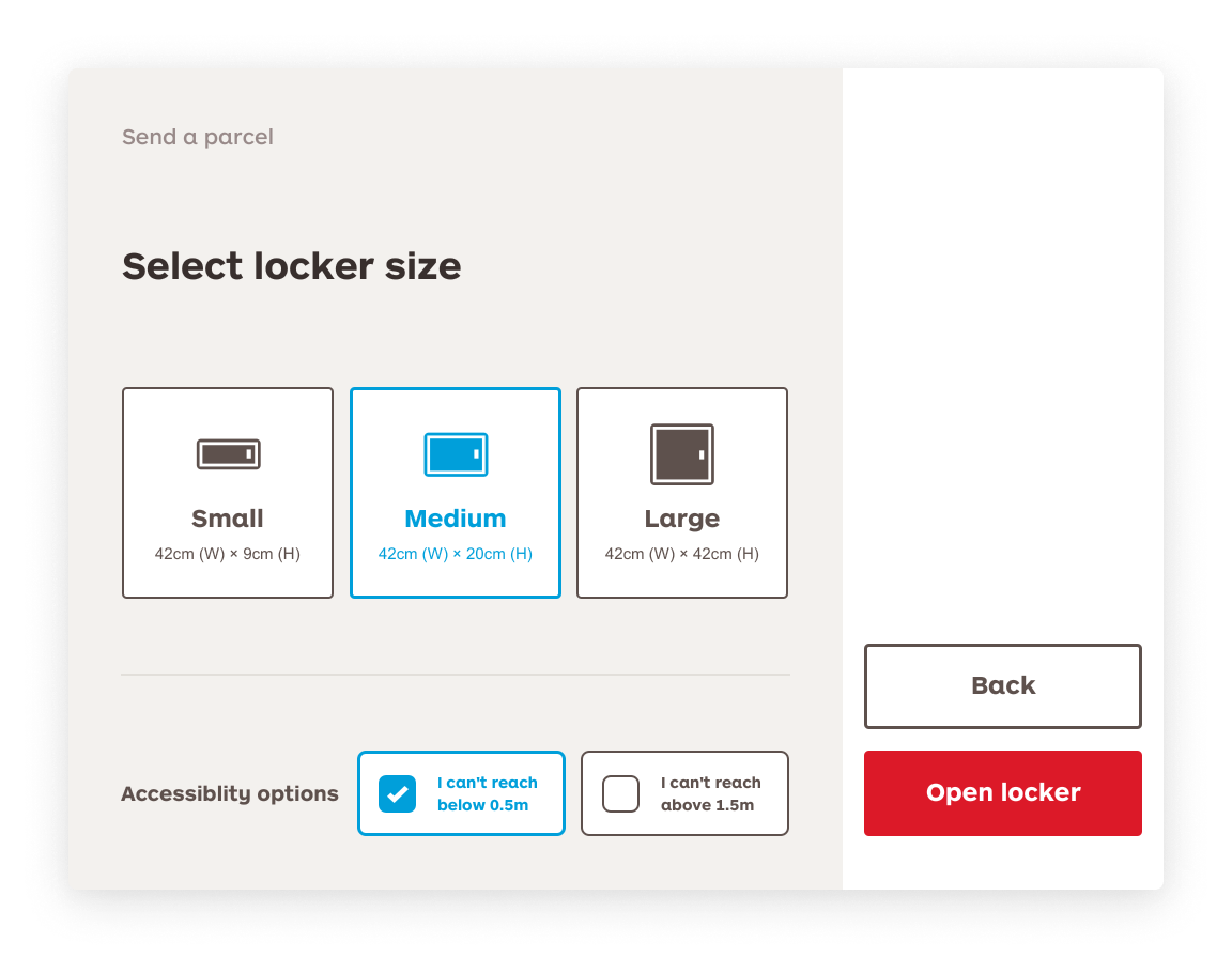
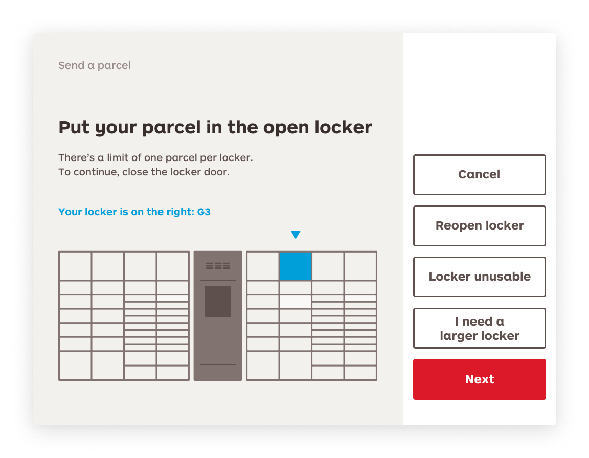
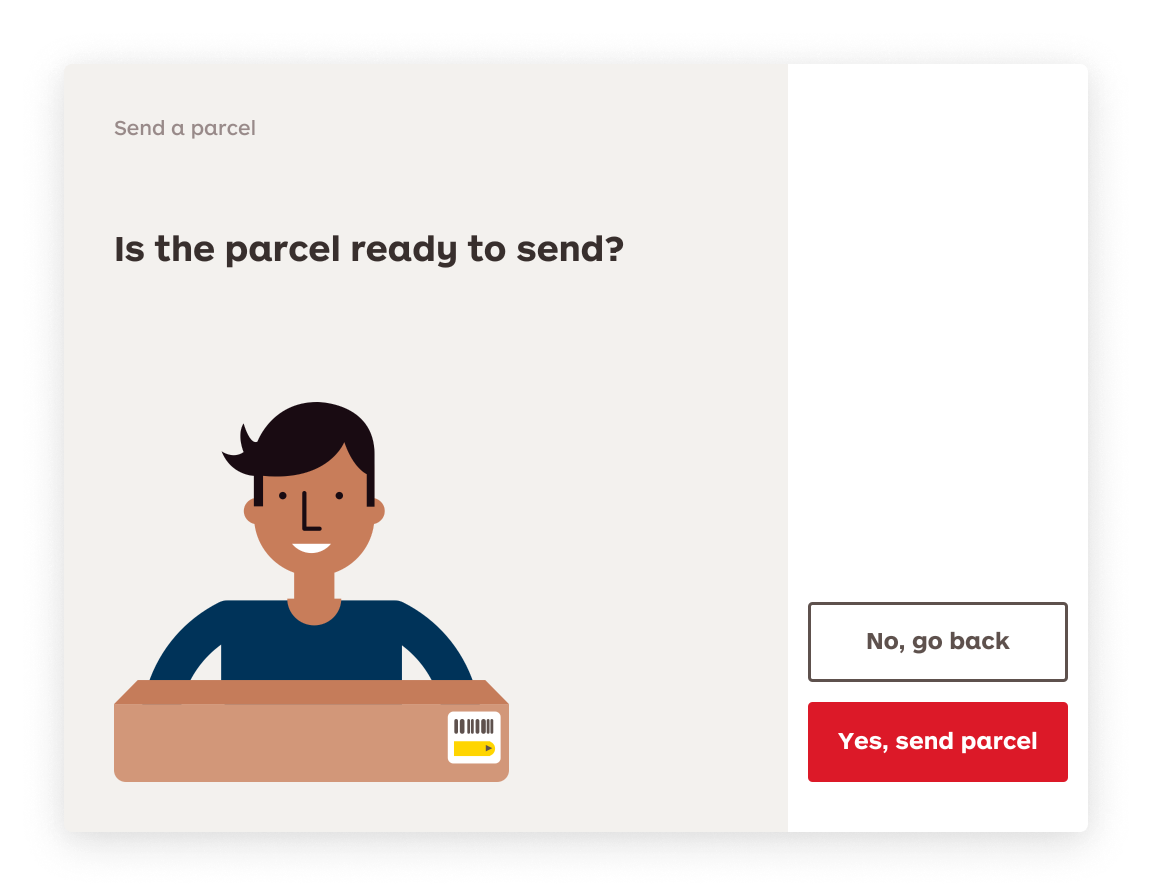
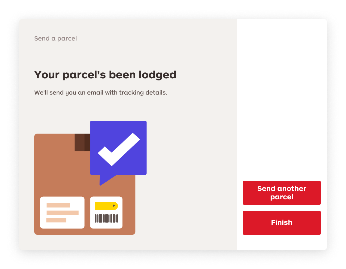
Wireframes and prototypes were tested against the different sizes and orientations of each display generation. To ensure wheelchair accessibility, all content and call-to-actions were placed in the lower part of the screen. The highest-priority element was placed on the bottom right-hand side of the screen on horizontal orientation, and alongside the bottom edge of the screen for the portrait orientations.
Reviewing the content
Content was reviewed to prioritise the most common method used by customers. Technical jargon was removed and replaced with simple action words. Not all elements could remain in a consistent place due to size limitations, so important elements were placed in contextually relevant positions e.g. a “need help scanning?” call-to-action was located below the scanning illustration.
Adapting brand guidelines for outdoors
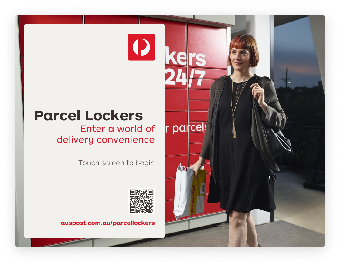
For the final design we needed to adapt the new corporate design guidelines to be suitable to an outdoor interface. This meant larger typefaces and highly contrasted colours. Additional verbal instructions were recorded for customers with vision impairments. An accessibility consultant was hired to review the design changes before go-live.
Results
The update was rolled out Australia-wide at the beginning of the 2016 financial year alongside an online and retail advertising push. Deliveries to parcel lockers grew by 43% from 2015 to 2016. In 2017, deliveries to parcel lockers grew by a further 41% - far above the 10% growth seen in overall domestic deliveries. Customer feedback was monitored post go-live and was very positive.
Parcel lockers are terrific. The only way to improve them is to make more of them. Also, I like that the pickup email no longer says 'you and your parcel look so happy together' - that was creepy!
Love the new updates and ease of use. Tracking is better and so is collecting from parcel lockers.
